
Sunday, April 28, 2013
Week 14 Design For A Cause
For this assignment I decided to create a poster for ASPCA the American Society for the Prevention of Cruelty to Animals because I love animals and hate seeing them being treated badly. For my poster I decided to use the same hue with different values. I chose orange because the ASPCA website used orange in its color scheme.

Sunday, April 21, 2013
Week 13 Color Assignment
Here is my color wheel design, color schemes, and hue test.
Color Wheel

For my color scales I did white to blue, blue to orange, and red to green.


Color Wheel

Color Scales

Online Hue Test

Sunday, April 14, 2013
Week 12 Value Self Portrait
For this assignment I sketched myself out on paper and then I brought it into Photoshop and added in my textures. Even though this took a while to do it was very fun!


Sunday, April 7, 2013
Week 11 Illusion of Space and Motion
For illusion of space I chose to find examples of size, linear perspective, and overlapping.
Size
This poster of Harry Potter is an example of size. Harry is the biggest person in the image because he is closer to the front of the image. Everyone behind him start to get smaller because they are further away from the front of the image.

Original image
http://images1.fanpop.com/images/photos/1900000/Harry-Potter-cast-harry-potter-and-the-goblet-of-fire-1913230-2560-1924.jpg
Linear Perspective
This painting called Alley By The Lake by Leonid Afremov is an example of linear perspective. The light posts, trees, and sidewalk start to get smaller as they get further away and they all meet at a single point in the lower right of the painting.

Original image
http://fineartamerica.com/featured/alley-by-the-lake-leonid-afremov.html
Overlapping
This image shows fish overlapping each other. The fish on the very top are bigger than the fish underneath because the fish on the top are in front of the fish in the back showing that they are closer.

Original image
http://www.deshow.net/cartoon/liang-yansheng-chinese-art-531.html

Original image


Size
This poster of Harry Potter is an example of size. Harry is the biggest person in the image because he is closer to the front of the image. Everyone behind him start to get smaller because they are further away from the front of the image.
Original image
http://images1.fanpop.com/images/photos/1900000/Harry-Potter-cast-harry-potter-and-the-goblet-of-fire-1913230-2560-1924.jpg
Linear Perspective
This painting called Alley By The Lake by Leonid Afremov is an example of linear perspective. The light posts, trees, and sidewalk start to get smaller as they get further away and they all meet at a single point in the lower right of the painting.
Original image
http://fineartamerica.com/featured/alley-by-the-lake-leonid-afremov.html
Overlapping
This image shows fish overlapping each other. The fish on the very top are bigger than the fish underneath because the fish on the top are in front of the fish in the back showing that they are closer.
Original image
http://www.deshow.net/cartoon/liang-yansheng-chinese-art-531.html
For illusion of motion I chose to find examples of blurred outlines, multiple images, and anticipated motion.
Blurred Outlines
This photo of tumbling dice is an example of blurred outlines. You can see the motion of the dice turning as they bounce off the ground and are rolling. You can also see the numbers on the dice changing as they are moving too.
Original image
Multiple Images
This image shows multiple images of a cat falling and turning around in the air so that it can land on its feet. We can see each motion that the cat goes through in order to turn its body around.
Original image
Anticipated Motion
This image is showing the wave is in motion because the wave is curving down towards the boats and it looks like it is going to crash into the boats below.
Original image
Sunday, March 31, 2013
Week 10 Pattern and Texture
Here is my 15 patterns and textures sampler and my 11 shade grayscale. I used different fabrics with patterns and textures, jeans, my cats fur, food, and scratching post, a cleaning cloth, my ceiling, couch, feathers, and some different blankets.


15 Patterns and Textures

11 Shades Grayscale
Sunday, March 24, 2013
Week 9 Shape and Volume
For my shape and volume assignment I chose to use one of my kitchen chairs and a stool. I placed the stool in front of the chair on the left side and took pictures of it at different angles. These are the three angles that I liked the most.


Sunday, March 17, 2013
Week 8 Line
For this assignment I decided to do both traditional and digital media. I did the dry media drawings traditionally and the wet media drawings digitally. For dry media I used a 4B graphite pencil and a charcoal stick.
For dry media I chose happy, sad, angry, and love for my emotions. For happy and love I used a pencil, and for sad and angry I used charcoal.


For dry media I chose happy, sad, angry, and love for my emotions. For happy and love I used a pencil, and for sad and angry I used charcoal.

For wet media I used balance, stitch, drip, and repeat for my verbs. I choose an ink brush and an air brush.

For my second dry media I drew a cat bank that I have in my room. For contour and gesture I used a pencil, and for blind contour and gesture I used charcoal.

For my dry and wet media volume drawings I used a pencil and charcoal. For the air brush and ink volume drawings I used my tablet to draw them. I'm not very good at drawing with it yet.

Sunday, March 3, 2013
Week 6 Rhythm
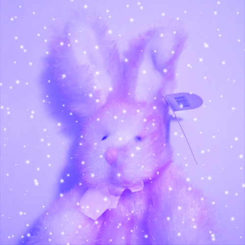
I chose the sense of touch for my assignment and I chose soft, rough, cold, and hot. I took a photo of a stuffed rabbit to represent touch. For soft I used a filter to make the photo look softer, and I did the same thing for rough. For cold I changed the color of the photo to blue and made it look like it was snowing. For hot I changed the color of the photo to orange and yellow and I made flames at the bottom of the photo. For my fifth design I chose alternating rhythm and I repeated my soft, rough, cold, and hot photos and I only used black and white values.


This is the original photo

Soft

Rough

Hot
Cold

Alternating Rhythm
Sunday, February 24, 2013
Week 5 Balance
Here are my balance compositions for this week. I took photos of eight different things I found in my kitchen and put them together in Photoshop. I used a knife, spoon, fork, measuring spoon, cup (I duplicated it so I would have two), spatula, plate and a slotted spoon. I hope that I did all of these right. The first one is the silhouette of the objects. The second one is the negative space between the objects, and the third one is the negative shapes combined in an interesting way.

Here is the silhouette of the objects composition.

Here is the negative space of the objects composition.

Here is the negative space shapes composition.
Sunday, February 17, 2013
Week 4 Scale and Proportion
I chose to make a collage with my cat Crystal. The big picture of her is the size she is now. I took a photo of her when she was a kitten and cut her out of the photo and pasted it in the bigger picture. I scaled her down to the size that a cat toy might be. Then I took another image that had a couple of her toy mice in it and cut them out and pasted them into the picture and scaled them up and made them a lot bigger than they should be. The focal point of the collage is the little Crystal sleeping on top of herself. I think that the mice in the front may get your attention first and then you follow Crystal's paws up to her face. Then you follow her eyes to the kitten version of herself sleeping. Small kitten Crystal is also bright and I think that it helps draw your eyes towards her more.


Kristina Willette, My Cat Collage
Sunday, February 10, 2013
Week 3 Emphasis and Focal Point
Contrast
Contrast is when an element in a design or piece of artwork differs from the other elements. I used a photo of my cat that I had taken in my photography class as an example. I made the whole photo black and white except for her eye. Crystal's yellow eye contrasts from the black and white background. The focal point is her eye because it is the only thing that has color in the entire photo and you see it right away.


One Element
One element is when you use a strong visual emphasis on one element which makes it stand out over everything else. This example is a painting by Yoshimoto Nara and its called Acid Rain. The girl stands out against the dark background and you see her first before you see the colors in the background and that she is standing in water or in something else. The focal point is the girl because she is the focus of the painting.


Placement
Placement is when several elements in a design or piece of artwork all point to one area or item. This example is a digital artwork done by Shu Mizoguchi and its called Axia. The lines in her dress all point towards the light coming from the violin. Her head is bent down looking towards the violin and light and her arm holding the bow also points at the white light. The focal point in this piece is the white light coming from the violin.


Isolation
Isolation is when one element in a design or piece of artwork is off by itself while all the other elements are close together. I had made this example for another class. I made one star all by itself while the rest of the stars are close together. The one star by itself stands out as the focal point because it is separated from the rest of the stars in the image.


Absence of Focal Point
Absence of focal point is when there is no clear focal point in a design or a piece of artwork and you see the entire image and your eyes do not focus on one point. This example is a painting done by Shiraga Kazuo and it's called Soryu no Mai. This painting has no clear focal point because paint was just splattered onto the canvas and he had painted the strokes of paint with his feet. The strokes of paint make your eyes wander all over the canvas and they do not stop at one point.

Contrast is when an element in a design or piece of artwork differs from the other elements. I used a photo of my cat that I had taken in my photography class as an example. I made the whole photo black and white except for her eye. Crystal's yellow eye contrasts from the black and white background. The focal point is her eye because it is the only thing that has color in the entire photo and you see it right away.

Kristina Willette, My Cat Crystal

Kristina Willette, My Cat Crystal
One Element
One element is when you use a strong visual emphasis on one element which makes it stand out over everything else. This example is a painting by Yoshimoto Nara and its called Acid Rain. The girl stands out against the dark background and you see her first before you see the colors in the background and that she is standing in water or in something else. The focal point is the girl because she is the focus of the painting.
Yoshimoto Nara, Acid Rain
Yoshimoto Nara, Acid Rain
Placement
Placement is when several elements in a design or piece of artwork all point to one area or item. This example is a digital artwork done by Shu Mizoguchi and its called Axia. The lines in her dress all point towards the light coming from the violin. Her head is bent down looking towards the violin and light and her arm holding the bow also points at the white light. The focal point in this piece is the white light coming from the violin.

Shu Mizoguchi, Axia

Shu Mizoguchi, Axia
Isolation
Isolation is when one element in a design or piece of artwork is off by itself while all the other elements are close together. I had made this example for another class. I made one star all by itself while the rest of the stars are close together. The one star by itself stands out as the focal point because it is separated from the rest of the stars in the image.

Kristina Willette, Emphasis on Isolation

Kristina Willette, Emphasis on Isolation
Absence of Focal Point
Absence of focal point is when there is no clear focal point in a design or a piece of artwork and you see the entire image and your eyes do not focus on one point. This example is a painting done by Shiraga Kazuo and it's called Soryu no Mai. This painting has no clear focal point because paint was just splattered onto the canvas and he had painted the strokes of paint with his feet. The strokes of paint make your eyes wander all over the canvas and they do not stop at one point.

Shiraga Kazuo, Soryu no Mai 1994
Sunday, February 3, 2013
Week 2 Unity
Proximity


Is when something in a design continues in a certain direction like a line, edge, and an object that points to another object. In this example the line in the middle of the H curves down and up towards the leaf.


Is when a design has so much going on in it that it is hard to see everything in the design and it looks chaotic. In this example there are a bunch of words overlapping each other and they are really close together which makes it hard to read the words.

Is when there is no clear meaning behind a design. In this example the squares and rectangles were placed close together, and the different colors make the design look interesting. This could also be an example of proximity.

Is when you show an emotion in a piece of art that is exaggerated. In this example it shows four women from different cultures united together. This piece has a peaceful and happy feeling to it. I think that this could also be an example of proximity because the women are standing close together.

Is when you put elements close together in an image. In this example it shows a bunch of small images of people playing sports placed close together to create a bigger image of someone on a unicycle.

Repetition (emphasis
on similarity)
Is when elements in a design are repeated and look similar to each other. This example shows coffee cups that look exactly the same but are facing in different directions. The word coffee is also repeated several times in different colors and sizes.

Repetition (emphasis
on variety)
Is when elements in a design are repeated but they look slightly different from each other. In this example the figures are all in the same pose and are holding heads but each head has a different facial expression.

Continuation
Is when something in a design continues in a certain direction like a line, edge, and an object that points to another object. In this example the line in the middle of the H curves down and up towards the leaf.
The grid as an organizing factor
Is when a piece of art is shown in horizontal and vertical lines that are aligned to form a grid. In this example there are six different versions of the man's head. Each square uses different colors. The grid makes the piece look organized and your eyes follow each row of images.

Chaotic unreadable image
Is when a design has so much going on in it that it is hard to see everything in the design and it looks chaotic. In this example there are a bunch of words overlapping each other and they are really close together which makes it hard to read the words.

Non-objective expression of unity
Is when there is no clear meaning behind a design. In this example the squares and rectangles were placed close together, and the different colors make the design look interesting. This could also be an example of proximity.

Figurative expression of unity
Is when you show an emotion in a piece of art that is exaggerated. In this example it shows four women from different cultures united together. This piece has a peaceful and happy feeling to it. I think that this could also be an example of proximity because the women are standing close together.

Sunday, January 27, 2013
Week 1 My Ideal 2D Design
My ideal 2-dimensional design is something that if full of colors, details, and stands out. When I see an image that has lots of colors and details it catches my eye right away. I love seeing multiple colors in one design because the colors make the shapes and details of a design stand out more. Here is an example of a design with lots of colors and details. There are so many different shapes in this design but you can see each of them because of the colors.


Jorge Enrique Villalobos Espinosa
A design does not have to have a lot of colors for me to like it either. If it has a lot of details but few colors then I will still like it. Here is an example of a design that uses only black, gray, and white colors and is very detailed.

Jorge Enrique Villalobos Espinosa
I love seeing details and colors but I also like seeing simple designs as well. If I think that they look, pretty, cute, or cool then they are good designs too.
Subscribe to:
Posts (Atom)